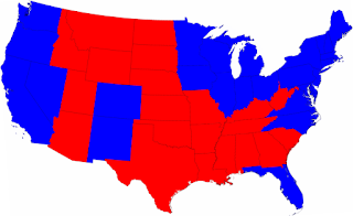
We're all familiar with this map from election night. Looking at it, you could get the impression that despite Barack's 6% lead in the popular vote the country is pretty evenly divided between reds and blues.
But check out these maps from Mark Newman at the Department of Physics and Center for the Study of Complex Systems, University of Michigan.

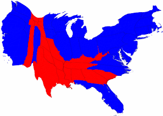
You get a different impression from this map, a cartogram, that shows each state weighted by population, ie they "are drawn with size proportional not to their acreage but to the number of their inhabitants, states with more people appearing larger than states with fewer." It still seems, though, that despite victories in Virginia and North Carolina the country is still very divided -- especially along Civil War-style North vs. South lines. Well, check out THIS map:

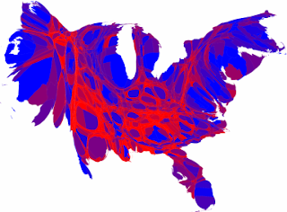
This map has used red and blue for counties in which more than 70% of the residents voted one way, but for all the counties where the vote was a little closer, they've used a representative shade of purple. Make this country seem a lot cooler, if you ask me.

2 comments:
Fascinating information
Real interesting...definitely seems like 4 years ago was some sort of climax where our polarization came to a head.
Post a Comment